

CCM Revolution
This project started out as a graphics package design for the KOHO subsidiary brand of CCM, which would be featured on goalie pads, blockers, and gloves. Upon it’s initial conception, my design was a sharp and very customizable graphic that played heavily into the look and feel of KOHO, but also had a more contemporary visual balance concerning color that was very in-depth in its execution. I wanted color balance to be equal in every piece of equipment, including the backs and sides of each piece, and it was important that the overall graphic featured “fingers up” symmetry, which catered the appearance of the overall package to what has become more common in goalie positioning. This design choice was unlike most brands who catered the visual design to downward hand (“fingers down”) positioning. Despite this change in position, few brands have made their designs match in this way, so I wanted that to be a hallmark of the design.
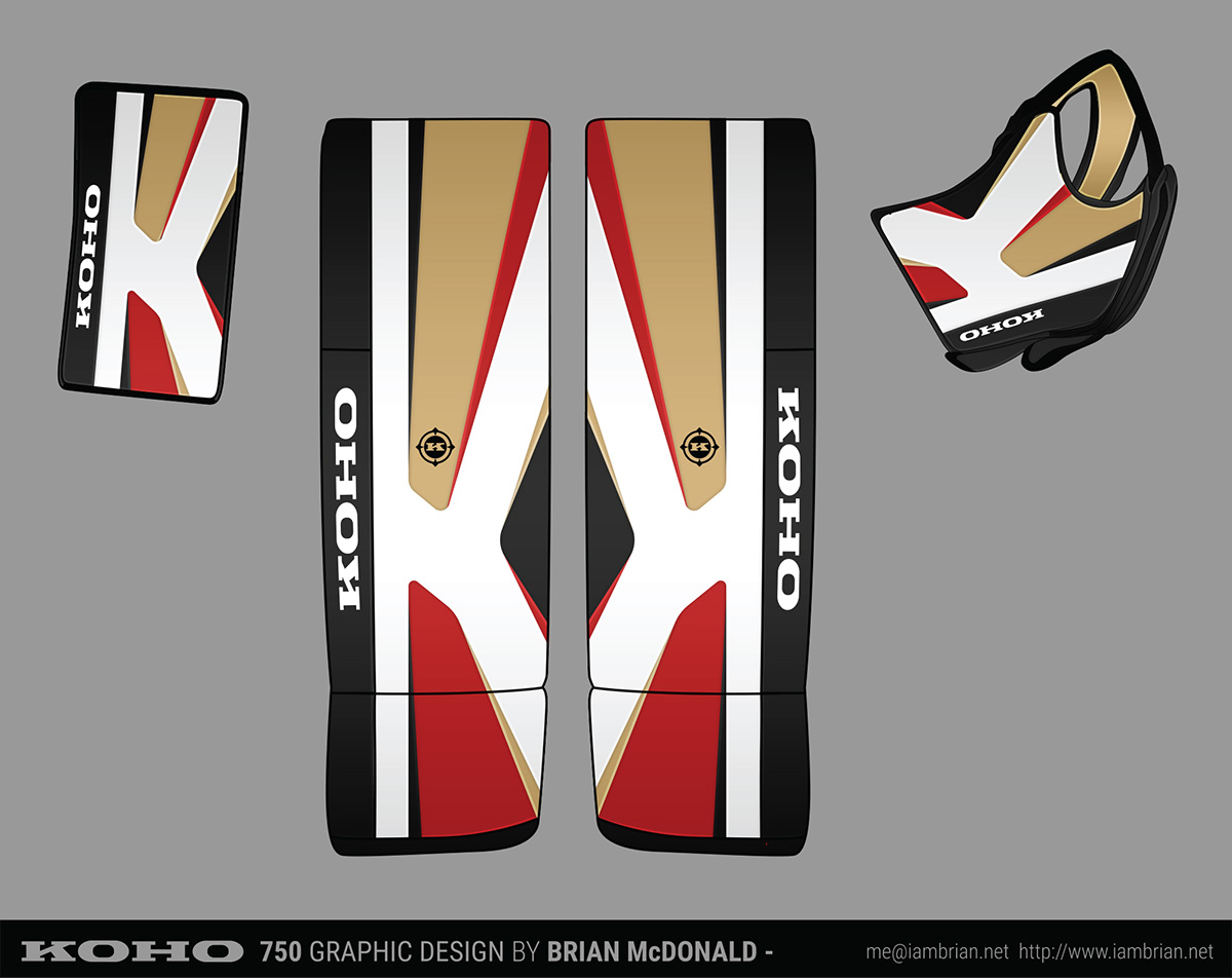 Initial 12-zone design
With 12 color zones, many different color schemes were achievable, which as a design philosophy was important to me because at the time, the KOHO brand had success as a line of more affordable equipment that was mixed and matched with other brands in addition to working as a set. I wanted the graphics package to be very cohesive overall, but with so many color options, you would also be able to match the look and feel to individual pieces to other brands if you weren’t buying a full set.
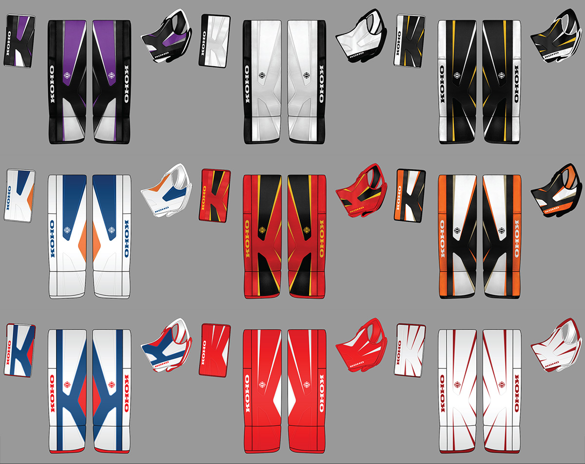 Various colorway possibilities with the initial design
After initial feedback, I was asked to alter the design to be a bit more rounded to tweak some proportions. It was also then where I was met with production limitations that would prevent the design from reaching its full potential. The amount of unique color zones had to be reduced by half, leading to a 6 zone setup. The overall feel was softened and widened, but the color balance system was still intact despite it being limited compared to the original design.
 Design after requested revisions
Unfortunately, that is where my involvement with the production ended. After a prototype was made with a drastically different glove design that I didn’t work on, I was under the impression that manufacturing of KOHO products was cancelled. However, a final product was released under the CCM brand name. The design proportions were further tweaked and it features a much simpler color scheme system with even fewer color zones. The visually balanced color system I imagined was never able to see the light of day, and the “fingers up” symmetry which set the design apart from every other company at the time of it’s creation was no longer there. While my design screams “KOHO”, having the CCM branding and the different glove design seems to take away from the cohesiveness it initially had.
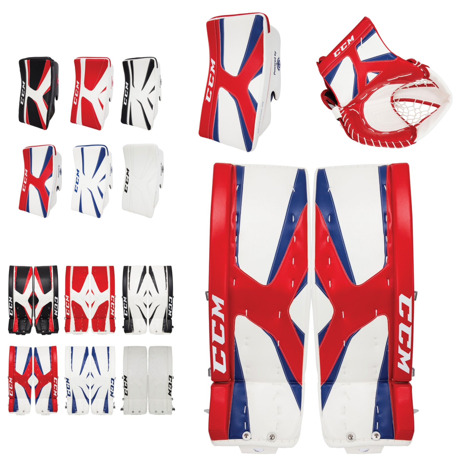 Final equipment appearance
